Lifestyles

Microsoft Is Choosing A New Default Font

While you’ve likely spent time using Microsoft Office programs like Word and Excel, chances are you haven’t paid much attention to the default font used ...

Read moreMicrosoft Is Choosing A New Default Font

Posted Updated
Microsoft Is Choosing A New Default Font

While you’ve likely spent time using Microsoft Office programs like Word and Excel, chances are you haven’t paid much attention to the default font used on these programs.

In fact, if you have a favorite font you always use in your documents, you may not even know the default font is currently Calibri and has been since 2007 (when it replaced Times New Roman). This year, however, Microsoft decided it’s time for a change and commissioned five independent designers to create custom fonts, one of which will replace Calibri in 2022.
To help choose the new font, Microsoft is asking users to head over to Twitter and tell them which one is their favorite.
We need to talk. What should our next default font be? pic.twitter.com/fV9thfdAr4— Microsoft (@Microsoft) April 28, 2021

While one of the new fonts will be chosen as the default, Calibri will still be available for you to use if you don’t like the new default.

The new fonts that are in the running to become the default font are called Tenorite, Bierstadt, Skeena, Seaford and Grandview.

Microsoft says the creators of the five fonts took into consideration the modern devices we use and the accessibility implications across languages. The new fonts span the various sans-serif styles — humanist, geometric, Swiss-style and industrial.
Before you let Microsoft know which one is your favorite, take a look at each font’s characteristics. Tenorite has the look of a traditional sans serif (a font without a serif, or a stroke at the ends), but with a friendlier style. Microsoft says other elements of the font, like accents and punctuation marks, make Tenorite comfortable to read at small sizes, like on your phone.

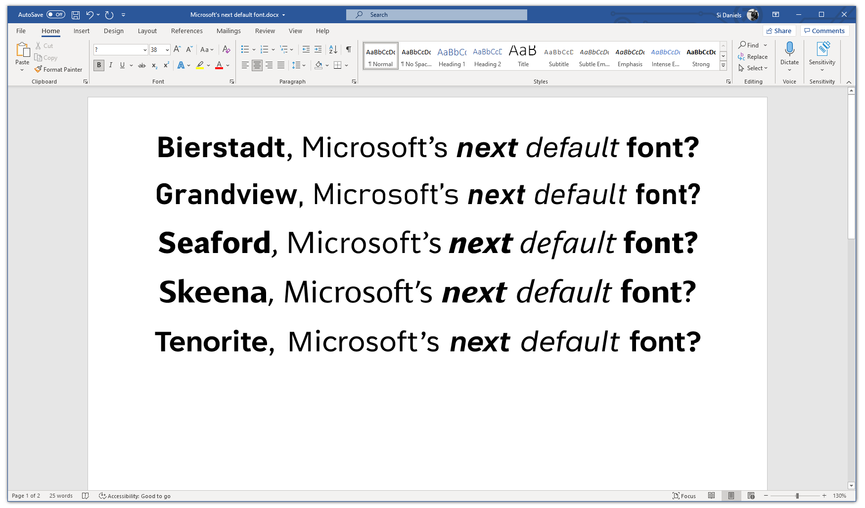
Next, Bierstadt is inspired by mid-20th-century Swiss typography and is notably clear-cut with, as Microsoft explains, “stroke endings that emphasize order and restraint.” Skeena, on the other hand, is a “humanist” sans-serif based on the shapes of traditional serif text typefaces, with contrast between thick and thin.

Seaford is rooted in old-style serif text typefaces, which makes it feel familiar. Its asymmetric forms make the differences between letters quite clear, creating more recognizable word shapes.

Lastly, Grandview’s origins are interesting, as the sans-serif typeface is derived from classic German road and railway signage. It has been designed to be legible at a distance and under poor conditions, so it would work well for long-form reading.
All five fonts are available via the cloud across Microsoft 365 apps and experiences, so you can begin using them before choosing a favorite.

Which font would you like to see as the new default?

This story originally appeared on Simplemost. Checkout Simplemost for additional stories.
Related stories

Copyright 2024 Simplemost. All rights reserved.