Today is the sixth annual “Show your Stripes” day, dedicated to raising climate change awareness through temperature trends.
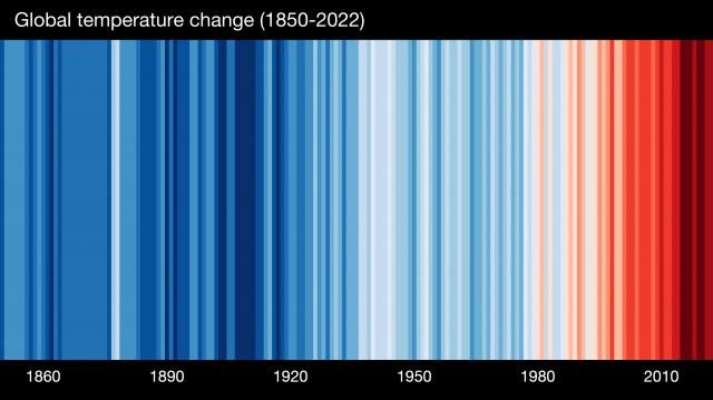
The visual comes from Ed Hawkins, a UK meteorologist, who created a simple striped design. Each stripe represents the global temperature averaged over one year, from 1850 to 2022. Red stripes are years that were hotter than the 1971-2000 average; blue stripes are years that were cooler.
Other WRAL Top Stories
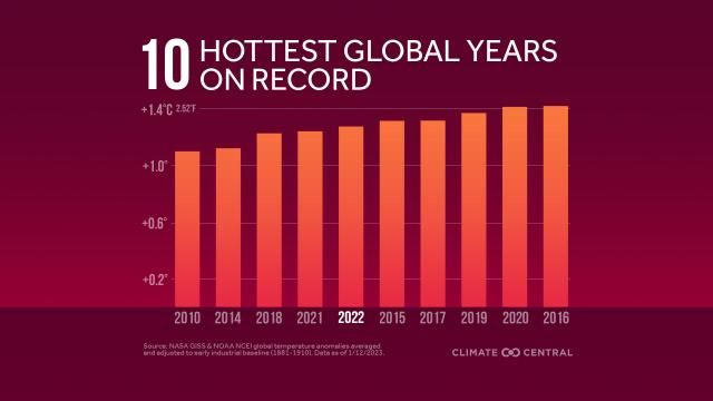
In fact, 10 of the hottest years on record globally have occurred in the past 12 years.
Climate scientists say this warming trend is driven by human-induced carbon pollution.
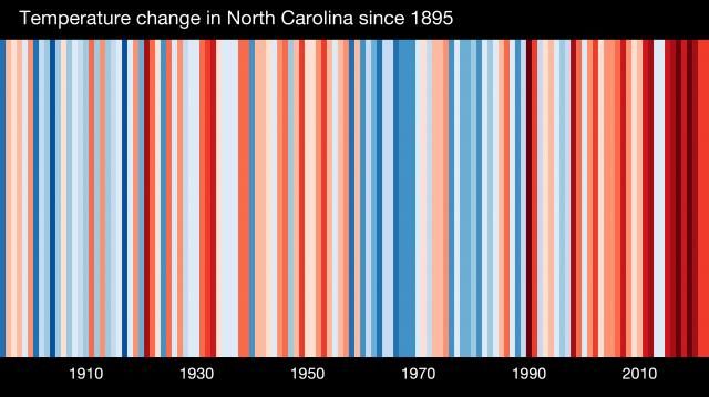
While North Carolina's stripes include some variability, the hot temperature averages have grown more frequent and extreme in recent decades.
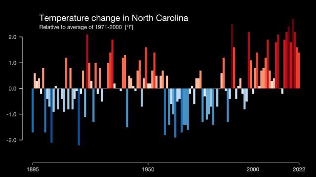
The breakdown of those temperatures indicate a dangerous path, warming more than 2 degrees Fahrenheit since the pre-industrial era and getting dangerously close to the 2.7-degree threshold that climate scientists say could be catastrophic for the planet.
Scientists say it's possible to keep warming in check if the high-pollution countries, including the U.S., can make deep cuts to emissions in the next few years.
See the warming stripes for 178 cities, 49 states, the U.S., and the globe using this tool.