Weather
You give us the 30 yr average temperatures. That is a mean of 30 years of observations averaged together right? Wouldn't it be a better indicator to give a 30 year mode instead of mean. That would give us the temperature that was observed the most times during the 30 year period. It is conceivable that the number given for a 30 year average might have never been observed during that 30 year period.
Posted — Updated
By Chad Salladay / Drew Echerd
Here is a related question from Drew: "With the forecast for this week warming up so much after so much cold my wife has again pointed out to me that we never seem to have "average" weather here in NC. Do we have more days with a greater separation between the highs and lows and the normals than anywhere else in the US? A color coded graphic with the number of days where the high or low has been greater or less than "x" degrees from the normal for the US would be very interesting".
MIKE MOSS SAYS: Chad and Drew, You both make good points, and it's certainly worth considering what the distribution of historical temperatures is like in addition to some of the central tendency statistics. We've been considering, for example, some way to include in our listings of high and low "normal" temperatures an indication of the typical variability of those temperatures to put a given observation into better context.
Perhaps the simplest way to do that would be to use the standard deviation, which indicates the values within which about 67% of the observed temperatures have fallen, assuming a near-normal distribution within the historical sample. The larger this value, the more frequently and/or farther we tend to deviate from the normal value. Also, as you mentioned, it can be useful to have a look at other values besides the mean, such as the mode (most frequently observed value) or median (the value that divides the observed set such that half are higher and half are lower). For a set of data with a perfectly normal (bell curve) distribution, the median, mode and mean would all be the same. Of course, in the real world, a sample that is based on only thirty values may vary from this ideal. Also, certain types of data are more prone to follow a normal distribution than others. For example, while one can compute mean, median and mode values for daily snowfall at RDU, you wouldn't expect a normal distribution because so many of the readings are simply zero, or a trace, interspersed with very infrequent readings of a few inches and the rare observation of 15 or 20 inches.
At any rate, I took a look at 30 years of daily maximum temperature data from RDU, across the 1971-2000 period that is currently used for computing "normals," for the coldest and warmest parts of the year. It turned out that the numbers were, to a reasonable degree, normally distributed, and that we did not, as it sometimes seems, swing so strongly from "above normal" to "below normal" with the passage of cold and warm fronts through the winter, for example, as to end up with a distribution featuring multiple peaks in the histogram that represents the distribution. In each case, for midsummer and midwinter, there was a slight skew such that a few extreme values pull the tails of the distribution a bit to the high side or low side, but not by all that much. In addition, as you would expect, the standard deviation, representing the year to year variability of temperature on a given day, is much larger during the winter than it is in midsummer when temperatures are often within just a few degrees of the same value from one year (not to mention day) to the next.
Here is how the numbers played out in this case:
For mid-January, when the "Normal" high is at its lowest annual value of 49 degrees, the mean high was 48.5 degrees, the median value was 47, the mode was 46, the standard deviation was 11.8 degrees, all across a range of highs from 17 to 75 degrees. The most frequent value is indeed a little lower than the "normal" and the average (mean), but not by much.
For mid-July, when the "Normal" high is at its highest annual value of 90 degrees, the mean high was 90.5 degrees, the median value was 91, the mode was 91, the standard deviation was 5.0 degrees, all across a range of highs from 77 to 100 degrees. The most frequent value here is only one degree above the average. It is notable how much narrower the range of temperatures is for summer than winter, and this results in a much smaller standard deviation.
One added item of note is to point out that the "normal" value we present on air is computed by the National Climatic Data Center, and is not necessarily the same as a straight 30 year average. This is because, in order to produce a smoothly varying normal that doesn't, for example, decrease for a couple of days, due to random variations and the fairly small sample size of 30 values, NCDC computes these normals in a way that will cause values to increase a little each day through the spring and vice versa for the fall, and to smoothly curve to a minimum in mid-January and a maximum in mid-July. They do this by using the 30 years' data to calculate MONTHLY averages, and then fit a smooth (cubic spline) curve to those averages in order to retrieve the daily numbers.
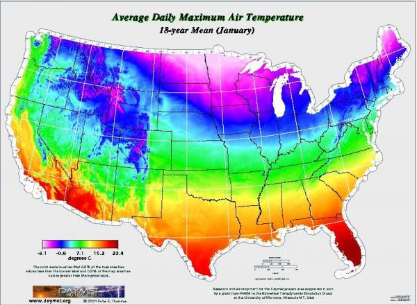
Drew, your suggestion about a map of daily high variability is a good one. I was unable to find or easily generate a map that directly illustrates the standard deviations for 1971-2000 that would correspond to the numbers I posted above or exceeds a threshold for variation from the mean as you mentioned. However, I did run across a site (www.daymet.org) that allowed generation of maps showing 18 year average maximum temperatures for January and July, and 18 year interannual standard deviation contours for the same period. You can cycle through the maps above, and click to enlarge each one.
I couldn't find an exact reference on the site as to how the standard deviation values were computed, but while the mapped mean temperatures for our area are very close to the values I noted above for RDU, the standard deviations on the map are much smaller. This may be a result of averaging across the entire months in question, but I'm not sure. Nonetheless, the values are notably larger for January than July, as noted above, and the relative regional variations that you were asking about are highlighted. Especially notable is how variable high temperatures are across the northern plains and midwest in winter, and across the northwestern U.S. in general during the summer. Otherwise, the general trend outside the complicating influence of the mountains is pretty much as expected, with coolest readings toward the north and northeast, and likewise more variability toward the north and interior sections of the country (stronger and more frequent frontal passages, sharper airmass changes, and more open to cold intrusions from Canada and warming from the south) and less variability toward the south, east of the Appalachians, and near the oceans and Gulf of Mexico (fewer frontal passages, blocking of some shallow but very cold airmasses by the Appalachians, and moderating influence of heat stored in nearby ocean waters).
Copyright 2024 by Capitol Broadcasting Company. All rights reserved. This material may not be published, broadcast, rewritten or redistributed.


