
There are a variety of means we in the WeatherCenter use to stay up to date on the science and practice of meteorology, and one of those is to participate in learning opportunities provided from time to time by our counterparts in the National Weather Service. Sometimes, that comes in the form of a local session on severe storms or winter weather forecasting, but this spring we've also had the chance to link up with the National Hurricane Center for some updates on the processes and procedures they use to project the path and intensity of tropical cyclones, and to provide information that those of us in the broadcast meteorology field can draw on to keep our viewers informed.
During one of those sessions yesterday, Dr Mike Brennan of NHC (a graduate of NCSU, by the way) showed a very nice illustration and by-product of how much the forecasting of tropical cyclone tracks has improved in the last decade or so. As computer models work with better inputs and improved algorithms, and use of multi-model "consensus" techniques add even more to the accuracy gains, errors in the official forecasts have been noticeably reduced, and one place that shows up is in the forecast "cone of uncertainty" that you are probably familiar with from broadcasts and web images.
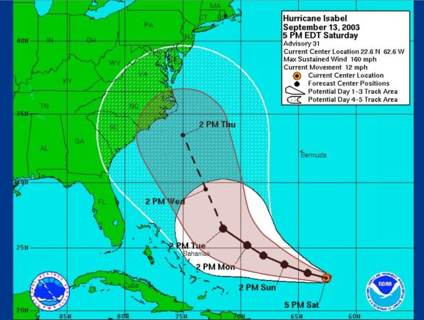
The first picture shown here uses a forecast of Hurricane Isabel's track back in 2003 as a background. The area within the white shading and the larger white outline shows, at that time, the area within which the position of the center of circulation would be expected to stay about 2/3 of the time, based on the average errors of NHC forecasts for the 5 years 1998-2002. The smaller "cone" outlined in red shows the area that would be applied to that same forecast track today, based on the average errors in NHC forecasts for the years 2007-2011.
This is very good news in most respects, of course, but Dr Brennan did point out that there is a counter-intuitive drawback involved, because they are concerned that with a narrower shaded zone, large storms are more likely than in the past to have some notable impacts on places that are outside the cone of uncertainty, even when the forecast track is nearly perfect. The takeaway here is that when you look at a map like this, whether on the web or on TV, the purpose of the shaded region is to show where the center of the storm is likely to travel, NOT the entire wind field, surge region or heavy rainfall region associated with the storm, any or all of which could significantly impact areas broader than the forecast cone itself.
If you wonder what the size of those average errors are and how they increase with time (because there is greater potential for error at 3 days in the future compared to 24 hours, for example), I've included a second graphic from yesterday's presentation that shows how the errors in both center location and intensity ramp up as you go further out in time. As shown here, for example, the average error in the past 5 years for position at 24 hours in advance has been 48 miles, while the average intensity error for that forecast period is 11 knots. The same errors 4 days in advance (96 hours) are 167 miles and 17 knots, respectively.
Copyright 2024 by Capitol Broadcasting Company. All rights reserved. This material may not be published, broadcast, rewritten or redistributed.


